
Clarity is conversion: why removing cognitive load is the cheapest growth lever
Every app competes for the same scarce attention. The friction you design out is the conversion you don't have to buy — a case for clean, low-effort interfaces.

Siarhei Tarasenka
Product Designer
There’s a version of design taste that treats “clean and simple” as a matter of style — a look you either like or you don’t. I’ve come to think of it as something much less decorative and much more economic. A clean, immediately readable interface isn’t a preference. It’s the shortest path between a user’s intent and their action, and on today’s internet that path is where products live or die.
The reason is the market everything now competes in. Not a market of features, and not really a market of time — a market of attention. Every app, every feed, every notification is bidding for the same scarce resource inside the same head. And attention, unlike time, doesn’t deplete gracefully. It collapses. The moment an interface asks a person to stop and figure something out, you’ve spent some of the very thing you were competing for — and you rarely get it back.
Cognitive load is friction, and friction leaks conversion
Every element on a screen is, quietly, a small question the user has to answer. What is this? Is it for me? What happens if I tap it? Which of these three things did I actually want? Individually the questions are trivial. In aggregate they are a tax, paid in attention, charged before the user has gotten anything in return.
This is what cognitive load really costs. John Sweller’s work framed it decades ago in a learning context: working memory is small and easily overrun, and when it’s overrun, performance drops. Steve Krug turned the same idea into the most quoted rule in our field — don’t make people think — precisely because thinking, at the wrong moment, is where you lose them. Hick’s Law puts numbers on one slice of it: more options means a longer decision, every time.
Stack these together and the picture is stark. Between intent (“I want to do this”) and action (“done”), you have placed a sequence of tiny toll booths. Each one is a chance for the user to hesitate, to doubt, to get distracted, to leave. Conversion isn’t lost in one dramatic failure. It erodes, one avoidable micro-decision at a time.
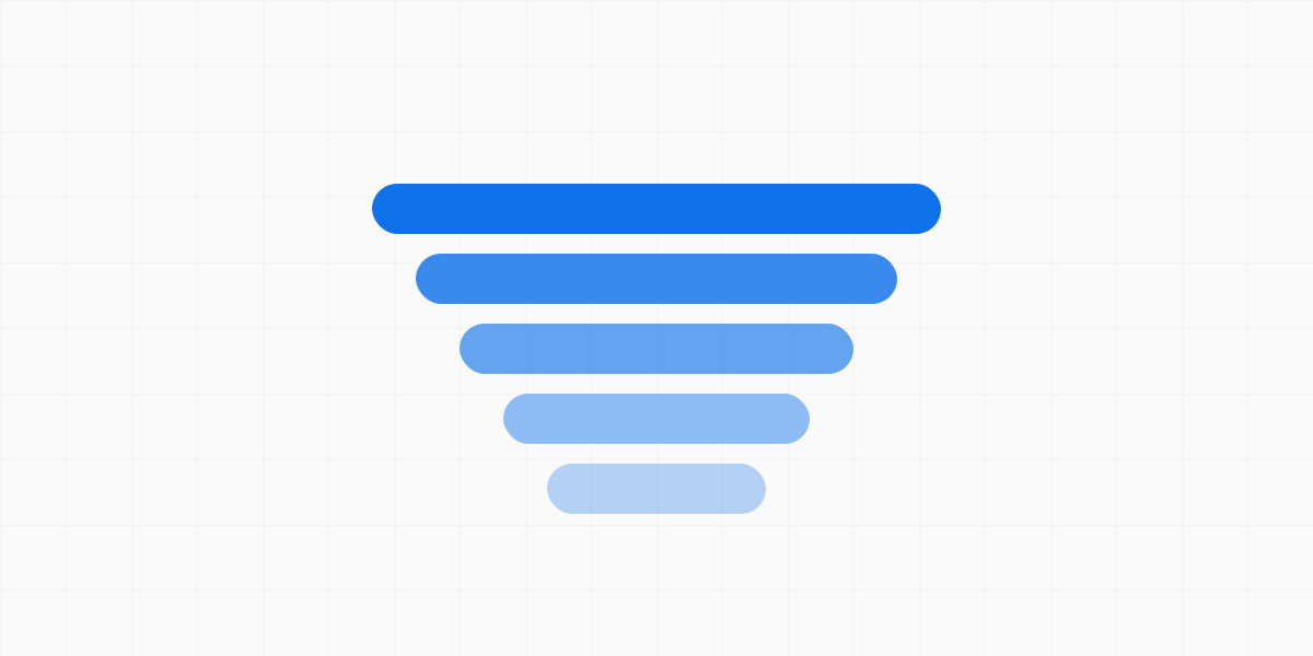
So when I remove a redundant field, collapse two competing calls-to-action into one, or cut a clever animation that delays the thing the user came for, I’m not tidying up. I’m removing friction from a funnel. And friction removed is conversion you didn’t have to buy with more traffic, more ad spend, or more persuasion. It’s the cheapest growth lever there is, because it’s already inside the product.
Clean is a claim about attention, not about emptiness
Here’s where the argument gets misread, so it’s worth being exact. Low cognitive load does not mean minimal-looking, sparse, or feature-poor. A dashboard dense with information can have low load if its structure matches the user’s mental model, and a nearly empty screen can have high load if what little it shows is ambiguous. Clarity is about how much the user has to reason to get to their goal — not about how much is on the screen.
That distinction matters because “simplify” is easy to weaponize into “remove things,” and removing the wrong things raises load rather than lowering it. Hide a control the user needs and you’ve traded a visible decision for an invisible search. Flatten a hierarchy that was doing real work and everything competes for attention equally, which is the same as nothing standing out at all. The goal isn’t less. The goal is less to think about — fewer questions between the person and the outcome.
Where it breaks
The honest tension: you can’t measure cognitive load directly, so you’re always working from proxies — hesitation, support tickets, drop-off at a specific step, the user who says “it’s fine” while their cursor circles the screen. It’s easy to convince yourself an interface is clear because you built it and you already hold the whole model in your head. The map is clear to the mapmaker. The rule that keeps me honest is to watch a real person reach for the goal cold, and treat every pause as a bill the design is charging that I hadn’t accounted for.
The second failure mode is optimizing the wrong path clean. Strip friction from a flow nobody takes and you’ve polished a corridor to an empty room. Load reduction only pays where intent and action actually meet — so the discipline is knowing which single path is the one that converts, and defending that one ruthlessly while letting the rest be merely good.
The interface that gets out of the way
The best compliment an interface can earn is that no one remembers using it. Not because it was forgettable, but because it never made itself the obstacle — it stayed transparent, and left only the outcome the user came for. That’s the standard I design toward: remove enough cognitive load that the product almost disappears, and what’s left is a person getting what they wanted, faster than they expected, without once having to stop and think about the thing standing between them and it.
Clarity is conversion. Everything else is negotiation over how much attention you’re willing to waste.
Siarhei Tarasenka
Product Designer
Product designer, manager, and team lead with 18+ years of experience. Ex-principal designer of a top-charting AI assistant with 100M+ downloads. Creator of the Veritheme design system; IADAS member and judge at the Webby and Lovie Awards.
Follow