
Cross-platform design systems: share the tokens, split the components
One file trying to run iOS, Android, and web at once buckles. What's actually shared is narrow — colours and icons — while the components diverge. Design around that, not against it.

Siarhei Tarasenka
Product Designer
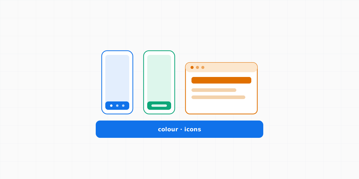
The dream is clean: one design system, three platforms, edit once. So teams reach for a single file meant to drive iOS, Android, and web at the same time — and it buckles. Not because the tooling is bad, but because the platforms are similar in spirit and different in exactly the parts a shared file has to pin down. The instinct to unify is right. The unit you try to unify is usually wrong.
The honest split is smaller than it looks.
What actually diverges: the native components
Start with the thing everyone reaches for first — a shared button — and it falls apart on contact with real state models. Web is built around hover and keyboard focus-visible, because web is pointer- and keyboard-first. Touch-native mobile has no persistent hover at all; it centres on the pressed state. Android’s Material spec, meanwhile, formally defines states that have no web equivalent — including dragged — and the web has :visited for links that neither native platform carries.
Notice what that table is not saying: it isn’t “web has more states.” It’s that the sets don’t line up. A shared button component has to either invent a state a platform doesn’t have or drop one it needs — so “shared” quietly means “compromised on all three.” And it only gets worse with structural components. An iOS tab bar and an Android bottom navigation are different objects with different behaviours, and the web typically has neither — it lives in top nav and sidebars. These aren’t skins of one component; they’re different components that happen to do a similar job.
That’s the crux: the component is the wrong thing to share. Force it and you pay the lowest-common-denominator tax, where the unified control is worse on every platform than the native one would have been.
What survives the split: the parts you brand
Pull back to what’s left when the components go their separate ways, and the honest answer isn’t a fixed list — it’s whatever you deliberately choose to keep consistent instead of handing to the platform. Nothing below is shared automatically; each of these can go native too. They’re just the strongest candidates, in order of how much brand they carry.
Colour. Every OS ships its own system palette, and you can absolutely go native with it. But if you want one recognisable product, you define a brand palette and share it across all three. Colour is the best candidate because it’s identity, not interaction — your blue carries no platform assumptions — yet sharing it is still a decision: brand consistency over native default.
Icons. Icons are native by default too — SF Symbols on iOS, Material Symbols on Android — and if you lean on the system sets, they diverge. What’s cross-platform is your custom icon set: draw a feature’s glyph once and it rides across every platform. So the shareable icons aren’t “icons” in general — they’re the ones you own.
Structure the system around that reality: put colour tokens and your icon set in one small shared source — the same theme.json idea does the colour half — and let each platform own its components. Change a colour once and it updates across all three; ship a feature that exists everywhere and its icon and tokens are already there. You never fight the framework to make a Material bottom nav behave like a UIKit tab bar, because you never asked them to be the same object.
Typography carries less of the identity than colour or icons, so it’s less worth fighting for — but the same logic holds. Native type (SF Pro on iOS, Roboto on Android) by default; a brand typeface shared across all three when the product has one. Treat it as platform-owned unless you’ve deliberately made your type part of the brand.
The pattern underneath all three is identical: the cross-platform layer isn’t a fixed set of things, it’s the set of things you choose to keep consistent because they carry the brand — palette, custom icons, maybe type. Everything you don’t brand, you let the platform own.
Where it breaks
“Share colour and icons, split everything else” is a good default and a bad dogma. Four honest caveats.
Colour + icons is the floor, not the ceiling. Plenty more can travel: spacing scales, radius, motion durations, semantic naming, content and UX writing, information architecture. Those aren’t components, so the platform split doesn’t force them apart. Share what’s genuinely shared — just don’t share the components, and don’t stop at colour reflexively when more is safe to unify.
Icons aren’t always identical — respect platform idioms. System actions have platform conventions (the share glyph on iOS reads differently from Android’s), and forcing your custom icon where users expect the native one feels foreign. Share your product-specific icons; defer to the platform for its system vocabulary.
Splitting multiplies work and can drift the other way. Three codebases, three buttons, slowly disagreeing. The shared token layer plus a shared spec — not shared component code — is what keeps them coherent. And cross-platform frameworks (React Native, Flutter, Compose Multiplatform) exist precisely to re-share the component layer; when the cost of divergence outweighs the value of native fidelity, they’re a legitimate answer, not a wrong turn. It’s a trade-off, chosen on purpose.
The generalisations have exceptions. Mobile web and PWAs sometimes do use a bottom nav; iPad with a pointer does get hover. The point isn’t that these never happen — it’s that the pattern is native-owned, decided per platform, not pinned down in one shared file.
The shape of it
A cross-platform design system isn’t one thing pretending to be three. It’s a thin shared spine — the parts you brand (colour, custom icons, maybe type) — with three native bodies hanging off it. Share what’s identity; let each platform own what’s interaction. The unified file was never the goal. A coherent product on every platform was — and you get closer to it by sharing less, deliberately, than by sharing everything and calling the compromise a system.
Siarhei Tarasenka
Product Designer
Product designer, manager, and team lead with 18+ years of experience. Ex-principal designer of a top-charting AI assistant with 100M+ downloads. Creator of the Veritheme design system; IADAS member and judge at the Webby and Lovie Awards.
Follow