
Naming design tokens: eight heuristics for where the three-tier model stops helping
On making spacing and radius as semantically clear as color and type — and the rules that take over when the textbook goes quiet.

Siarhei Tarasenka
Product Designer
I’ve spent a lot of time trying to make spacing and radius variables as semantically clear as color and typography variables. Color and type cooperate. Spacing and radius resist — and that resistance, it turns out, is where most of a design system’s naming problems actually live.
I’ve tested a lot of design systems, and the thing that consistently bothers me is their excess: the sheer number of tokens, and a semantic layer that gets complicated fast. So I keep chasing the opposite — the smallest set of tokens that still covers the most situations. Bloating a system is always easy; finding a small, opinionated set that stays elegant across very different projects is the hard part, and it’s closer to craft than to method. That ongoing search is where these rules came from.
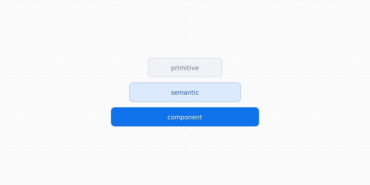
The standard model is familiar: primitive → semantic → component. Raw values at the bottom, meaning in the middle, per-component overrides on top. As far as it goes, it’s correct. But it describes the layers — not what to put on them. It tells you the tiers exist, and then goes quiet at the exact moment you have to decide whether a given value has earned a name, whether it should stay a primitive, or how to stop it from being applied in the wrong place.
Raw values — the options.
blue-500 #3B82F6 space-4 16px radius-2 8px Meaning — the choices.
color.border blue-500 text.primary ink-900 card.gap space-4 Per-component overrides.
button.padding-x space-4 input.radius radius-2 I’m not the first to run into this. Nathan Curtis, in Naming Tokens in Design Systems, framed primitives as the options and semantic tokens as the choices. Nate Baldwin raised the question of when a semantic token stops being semantic — the moment it loses clear intent. The team at PayFit, documenting their token taxonomy in the open, decided to keep spacing as primitives only, declining to pretend a semantic spacing layer was earning its place. The problem, in short, is known.
What I haven’t seen written down is the operational part: the rules you actually run in your head before committing to a token. So I wrote down mine — eight of them, in the spirit of Nielsen’s heuristics. Not laws or proofs, but rules that have held up across enough real systems that I now apply them deliberately instead of stumbling into them. Here they are, each with the place it tends to break.
1. If a value repeats, it needs to be extracted
Underneath this sits the principle of a single source of truth.
A value that appears exactly once, in one place, is just a value. There’s nothing to keep in sync, so extracting it into a token buys you nothing but one more entity to maintain.
But the moment that same element shows up on a second screen, the situation changes fundamentally. Now you have two copies that have to stay identical. And the only reliable way to guarantee that is to define the value once and reference it everywhere. Promote it to a variable or a component, and any change to the single definition propagates to every instance automatically — instead of you hunting the copies down by hand across the interface.
So the trigger here isn’t taste, and it isn’t tidiness. It’s duplication. One appearance is a value that can happily live inline. Two or more is an entity that needs a single source of truth, because the task has shifted: no longer “create consistency,” but “maintain it over time.”
And here’s where the rule tends to break. Someone has to notice the second appearance and promote it before the copies start to drift. The rule is clean but it doesn’t enforce itself. A missed moment turns the system into a pile of hard-coded duplicates — exactly the drift the single source was meant to prevent.
2. An alias with no meaning is just an extra layer
If a token adds neither context nor a constraint, it doesn’t improve the system — it complicates it.
Take spacing.md = 8, with padding.inner = spacing.md created on top of it. On paper this looks like structuring. In practice it’s just a rename of the same value, with no change to its behavior or its meaning.
The problem isn’t cosmetic, it’s architectural. Every extra layer is an object you now have to remember, explain, keep in sync, and account for on every change. And the more of these empty aliases pile up, the more the system runs on agreements held in the team’s head rather than on its own structure.
As Nate Baldwin points out, constructions like this often create the feeling of architecture without any real gain in clarity or control. Changing such a token blasts through the system with the same radius as changing the primitive itself — so it was never really a separate “choice” at all.
An alias earns its place only when it does one of two real things: it carries genuine intent (color.border actually tells you where it’s used), or it constrains the available set. The second is its own heuristic, further down.
Where it breaks: “does it add meaning” is a judgment call right at the boundary, where a role is almost but not quite unique. Sometimes you only learn whether an alias was an empty layer or foresight once the system has grown around it.
3. A name should describe a role, not a size
A good name answers “what function does this serve in the interface,” not “how big is it.”
color.border states a role immediately — a border. color-500 gives you nothing but a position on an abstract ramp. A ramp can be useful as a technical layer, but with no meaning attached it stays a numbering system that requires outside interpretation.
Sizes are the same. 2xl, 3xl, 4xl aren’t names, they’re a counter passing magnitude off as meaning. The rule is simple: if a token has a stable role, name it for that role; if it honestly doesn’t, leave it a primitive rather than dressing a number up as a decision.
Where it breaks: plenty of tokens really are just magnitudes with no single role, and forcing intent onto them produces fake semantics that’s worse than an honest number — which is what the next, harder rule is about.
4. Typography already solved this through roles — look at iOS
It’s worth noticing that in typography this problem is, in practice, already solved.
In iOS, in Apple’s Human Interface Guidelines, text styles are named not by size but by function: title, headline, body, caption, footnote. And what matters here isn’t that it’s a set of nice labels. What matters is that the name already carries the behavioral role of the text in the interface.
title The screen’s heading headline A section headline body The main readable text the meaning flows through. caption Supporting information footnote Secondary, reference-level note title is the heading that structures the screen and sets hierarchy. body is the main readable text the meaning flows through. caption is supporting information that props up the primary content. footnote is a secondary, almost reference-level layer, often clarifying.
You don’t think in pixels. You think about what function the text performs. And that sharply reduces the number of decisions you have to make by hand while designing — because the name has already done half the work for you.
That’s what to aim for in other token types too. But — and this is the next heuristic — it isn’t achievable everywhere.
5. Color and type default to semantic; spacing defaults to primitive
Different token types deserve different defaults, and trying to treat them uniformly is the original mistake.
Semantic naming works cleanly for color (text.primary, surface.danger) and well for typography — exactly the iOS case above. The reason is that those tokens almost always carry a single, stable role.
And it breaks down for spacing. Because one spacing value serves several incompatible roles at once: padding here, margin there, a gap between cards, a fixed height somewhere else. You can’t name it for its purpose, because it has several purposes in the same instant. This is the core reason spacing resists the semantic clarity color and type accept so easily.
So the defaults should differ by type. Color and type lean semantic. Spacing stays primitive — and earns a semantic name only for a specific, recurring role that genuinely justifies it: a card gap that’s always the same gap. The PayFit team reached the same conclusion independently, which isn’t a coincidence so much as the material teaching everyone the same lesson.
Where it breaks: “a specific, recurring role” is, again, a judgment call that points back to the first heuristic. And teams that value uniformity for its own sake will resist a different default per token type, even when it’s the right one.
6. Scales like big / huge / large break down fast
At first it seems like you could just agree on a set of words — small, medium, large, huge — and get a clear system. In reality those scales degrade quickly.
First, they have no clear boundaries. Where large ends and huge begins is always a matter of interpretation, not measurement. Second, different people read the same words differently: for one person big is 20–24px, for another it’s already 40px, and language has no built-in calibration for that. Third, language simply isn’t a measurement scale — it works through context and comparison, not fixed intervals.
And at some point the system starts to grow not by logic but by emotional escalation: small → medium → large → extra-large → huge → massive → giant. That’s no longer a scale; it’s an attempt to compensate for missing structure by intensifying the words. Order gets lost, because words guarantee no strict sequence.
That’s why the boring xs, sm, md, lg, xl holds up better in practice: the scale has an unambiguous order, and it reads the same across radius, spacing, and type, so the logic is learned once.
xs 4px sm 8px md 16px lg 24px xl 40px But the honest limitation matters: the scale itself doesn’t create meaning. It only gives you relativity. xl doesn’t tell you “extra-large relative to what.” Meaning appears only once it’s clear how and where the value is used in the interface — and that anchor lives in a separate usage rule, not in the name.
7. Constraint matters more than the name
Sometimes the system’s problem isn’t the names at all — it’s that there are simply too many options.
If a given context genuinely needs 3–4 values, it’s better to constrain the system to those than to try to name 20 variants perfectly. Because cognitive load grows not from the complexity of the names, but from the number of decisions you have to make at the moment of use.
And here the name stops being the only tool. Figma lets you scope a variable — control which tokens are even available in a given context. If inner padding should only ever be 8 / 16 / 24, the better move isn’t to invent the perfect label, it’s to make the other values unavailable there. A precise name and a tight scope then do together what a name can’t do alone: they make the right choice obvious by removing the wrong ones.
Only 8 / 16 / 24 are offered in this context — the rest are out of scope, so the wrong choice can’t be made.
Where it breaks: scoping relocates the work rather than removing it — those limits have to be set up and maintained — and over-scoping can constrain a designer more than it helps. That’s why the last heuristic exists as a counterweight.
8. Semantics should guide, not lock you in
A good system should guide the choice without turning into a rigid construction that gets in the way of the work. Because interfaces almost always spill past the ideal model.
The conventional advice is to hide primitives entirely and expose only the semantic layer. But the semantic layer never covers every real case. And when a designer genuinely needs a one-off, a fully locked system pushes them into one of two bad moves: spawn a junk token, or hard-code a value entirely outside the system — and hard-coding is the worst case, the direct source of drift. So semantics should be the default surface, not a prison: meaningful options on top, the full palette reachable underneath.
And if designers start bypassing the system en masse, that isn’t a discipline problem. It’s a signal that the model no longer matches the interface’s real behavior and needs to be rebuilt. Reaching for raw primitives should be read not as a violation but as a bug report: the system reporting a hole that a new token should fill.
Where it breaks: a visible escape hatch is still an escape hatch, and the line between a fair exception and a quiet bypass is real but unformalized. And, as in the first heuristic, a one-off that starts recurring was never an exception to begin with.
The constraint all these rules run into
Look back across the eight rules and one pattern runs through them: the working fix is repeatedly a constraint or a relationship, not a better name. And that’s exactly where current tooling stops.
Figma has come a long way. Scopes are real, and modes let one variable hold different values per context — desktop and mobile, light and dark. But one gap shapes everything above: in the static token layer, a token still can’t be defined as a function of another. There’s no spacing.lg = base × 1.5 that cascades, no rem, no relative unit. To support desktop and mobile you make a mode and type each recalculated value by hand — performing arithmetic the platform could derive on its own. Figma is beginning to add expressions and conditional logic, in prototyping and a computed-variable beta, but it hasn’t reached everyday design tokens yet.
Even the emerging standard points the same way. The W3C Design Tokens Community Group format — which reached its first stable version in late 2025 — defines a token as, at minimum, a name/value pair: a value is declared, and relationships are expressed only tentatively, through aliases. It standardizes how we store decisions, not how they relate.
This is the deeper constraint beneath all the rules: the tools let us declare values but not relate them. A token knows its value. It doesn’t know its purpose, or how it connects to everything around it. We carry that knowledge in our heads and our naming conventions — which is precisely why naming feels so hard. We’re asking names to hold meaning the structure can’t yet express.
What stays open
These rules are how I close that gap by hand. They’re heuristics, not laws: derived from building real systems rather than from first principles, and the most useful response to them is disagreement.
There’s a flip side worth naming. As often as I see systems bloated with excess, I open other people’s projects and find the opposite — no structure at all: no variables, components scattered, color names that change from one project to the next. Both extremes make me wish the industry would converge on a shared baseline — the kind of common ground the Design Tokens standard is now trying to establish — something genuinely convenient for everyone, not just internally consistent for one team. These heuristics are my attempt at that baseline for myself.
I’m least sure about spacing, where I’m now convinced no one has a complete answer, myself included. If you have a naming system that survives contact with real spacing, I genuinely want to see it. The point of writing the rules down is to find out where yours diverge from mine.
Siarhei Tarasenka
Product Designer
Product designer, manager, and team lead with 18+ years of experience. Ex-principal designer of a top-charting AI assistant with 100M+ downloads. Creator of the Veritheme design system; IADAS member and judge at the Webby and Lovie Awards.
Follow