
AI is the third consumer of your design system
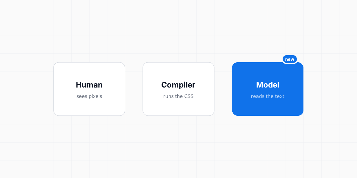
For twenty years design systems served two readers: humans and compilers. The third one — the model — can't see pixels and doesn't run CSS. It reads text, and most systems have nothing for it to read.

Siarhei Tarasenka
Product Designer
A team asks an AI assistant to build a screen “using our design system.” The output is competent and wrong. The blue is plausible but not theirs. The spacing is Tailwind’s idea of rhythm, not the system’s. The button is almost the right button, the way a stock photo is almost the right person. Someone screenshots it into Slack and the verdict lands: AI isn’t ready for real design work.
That’s the wrong verdict. The model read everything it was given and followed it faithfully. The problem is what it was given: nothing. The system lives in a Figma library the model can’t open and in compiled CSS that tells it values without meanings. From where the model sits, the design system doesn’t exist — so it did what any reader does with a blank page. It invented.
AI didn’t fail the design system. The design system failed its newest reader.
- #6366F1 — a plausible blue, nobody’s blue
- 13px body — below the system’s minimum
- two filled buttons — no action hierarchy
Teammates get access to every project in this workspace.
- accents-brand — the actual brand token
- type on the scale (14px body)
- one primary per view — rule, not taste
Two readers, twenty years
Design systems have always been built for an audience, and for two decades the audience was two-strong.
The first reader is human. For them we built Figma libraries, documentation sites, redlines, onboarding decks — artifacts optimized for eyes and judgment. The second reader is the compiler. For it we built CSS custom properties, component packages, type definitions — artifacts optimized for execution. Every mature system is really two systems in a trench coat: one legible to people, one legible to build tools.
And between those two readers, the whole time, lived the drift. Figma said one thing, the code said another, and “why doesn’t this match the design?” became a genre of Slack message. The fix — one machine-readable source both sides render from — took the industry twenty years to converge on, and most teams still aren’t there.
Now, before that migration is even finished, the audience has grown.
The third reader is unlike the first two
Models generate interfaces now. Describe a screen and you get markup, styles, layout — production-shaped output, in seconds, at volume. Within a couple of years this stops being a novelty workflow and becomes a default one, the way autocomplete became a default without a meeting. Which means the model is no longer a tool your system can ignore. It’s a consumer your system serves — the third one.
And it perceives your system in a way neither of the first two does.
.vt-btn-primary { background: hsl(var(--accents-brand)); } accents-brand — interactive elements only; one primary button per view It doesn’t see the render. The human reader looks at a component and absorbs a hundred decisions at once. The model gets none of that. A screenshot of your Figma library is close to the worst possible input — lossy, unstructured, ambiguous. A text file of tokens is close to the best. The entire visual layer your system spent years polishing is, to this reader, dark.
It reads semantics, not values. --color-500: #6366F1 tells a model almost nothing — a coordinate on a ramp it can’t see. accents-brand: interactive elements, and only them is an instruction it can follow. The name is the documentation now. Which lands somewhere uncomfortable: token naming was always half craft, half judgment call — and it just became prompt engineering. Every semantic name is a sentence in the prompt your system silently feeds to every model that touches it.
It arrives with amnesia. Your human readers accumulate context — a designer three years in carries the system in their head. The model shows up to every session newborn. Whatever isn’t in its context window isn’t in its world. A system that depends on tribal knowledge, on “ask Maria about the spacing rules,” on conventions that live in review comments, is a system with no persistent existence for this reader. It has to be self-describing — rules shipped next to values, in the same readable layer.
It fills silence with invention. A human designer, unsure, asks. A compiler, unsure, errors. A model, unsure, guesses — fluently, confidently, plausibly. Every gap in what your system states explicitly is a place where the model will produce something that looks like a decision you made. The generic screen from the opening isn’t a malfunction; it’s the average of the internet flowing into the vacuum your system left.
The machine-readability test
This suggests a concrete test, and I’d genuinely encourage running it on your own system this week.
Take every text artifact your design system has — token files, component docs, usage guidelines, whatever exists in a format that isn’t pixels. Paste it into a model’s context. No screenshots, no Figma links. Then ask it to build a screen you’d consider routine.
If the output would pass your design review, your system is machine-readable. If it wouldn’t, you’ve located precisely where the truth of your system lives somewhere text can’t reach:
- The truth is in the Figma library. The components are beautiful, canonical, and — to this reader — invisible. Figma is a rendering surface; the model needs the source that renders.
- The truth is in compiled CSS. The values are all there, stripped of every meaning.
13pxsurvives; why 13px, and why never for body text does not. - The truth is in people. The strongest rules — one primary action per view, when a card earns a border, what “dense” means here — were never written anywhere. For two readers out of three, that was fine. For the third, unwritten is nonexistent.
Most systems fail the test not because they lack information but because the information is stored in forms only the first two readers can consume. The test doesn’t measure how good your system is. It measures how much of it exists outside your team’s heads.
What the third reader changes about architecture
Take the third consumer seriously and several things stop being style preferences and become architectural requirements.
Tokens become the system’s interface. Not a convenience layer for theming — the one surface all three readers can consume. The human reads token names in Figma, the compiler resolves them in CSS, the model reads them as text. Everything that matters about the system’s identity has to pass through this layer, because it’s the only layer with three-way legibility.
Semantic naming becomes load-bearing. When names were for humans, a sloppy name cost a Slack question. When names are what the model acts on, a sloppy name costs wrong output at generation speed. The name has to carry enough intent to survive being read by something that can’t see what it points to.
AI context becomes a first-class deliverable. A system now ships three artifacts, not two: the library for humans, the package for compilers, and a readable bundle of tokens-plus-rules for models. This is the principle I’m building Veritheme around — one theme.json as the source, and an MCP server that hands any model the real components and the rules for using them, so generation composes from your parts instead of inventing primitives. But the principle is bigger than any one system: whatever you build, the model-facing artifact has to exist, and it has to be generated from the same source everything else is.
The flow gets a direction. Text renders to Figma, text compiles to code, text loads into context — and never the reverse. The moment a decision is made in Figma and lives only there, it’s invisible to two of your three readers. Figma becomes what it always should have been: a view of the system, not its home.
The obvious objections
“Multimodal models will just look at the screens.” They increasingly can. But a text source stays better even then — cheaper by orders of magnitude, deterministic where vision is probabilistic, and versionable in git where a screenshot is a moment in time. We don’t make compilers infer intent from renders, and vision being possible won’t make it the architecture. Reading the source beats reverse-engineering the output for machines exactly as it does for people.
“We have documentation.” Human documentation answers what does it look like and what do we call it. The third reader needs when do I use this and what am I forbidden to do — decision rules, not descriptions. Most design system docs, pasted into context, teach a model your vocabulary and none of your grammar. It’s not that the docs are bad; they’re addressed to a reader who can see.
“We don’t generate UI with AI.” Today. But an architecture decision made now outlives the workflow it was made in — systems last five years, and the readers they’ll serve in year three are already visible from here. Nobody built responsive layouts because their 2007 traffic was mobile. They built them because they could see where the readers were going.
The new maturity bar
We used to measure a design system’s maturity by coverage — how many components, how many platforms, how complete the documentation. That bar assumed two readers.
Here’s the bar with three: a design system is mature when all of its consumers read the same source — and the source is text. The human sees it rendered in Figma. The compiler executes it in the build. The model loads it into context. One definition, three projections, and no reader left to invent what it wasn’t told.
Twenty years ago, “the design system” became a file format the moment we wanted design and code to agree. It becomes one again, now that something new has learned to read.
Siarhei Tarasenka
Product Designer
Product designer, manager, and team lead with 18+ years of experience. Ex-principal designer of a top-charting AI assistant with 100M+ downloads. Creator of the Veritheme design system; IADAS member and judge at the Webby and Lovie Awards.
Follow